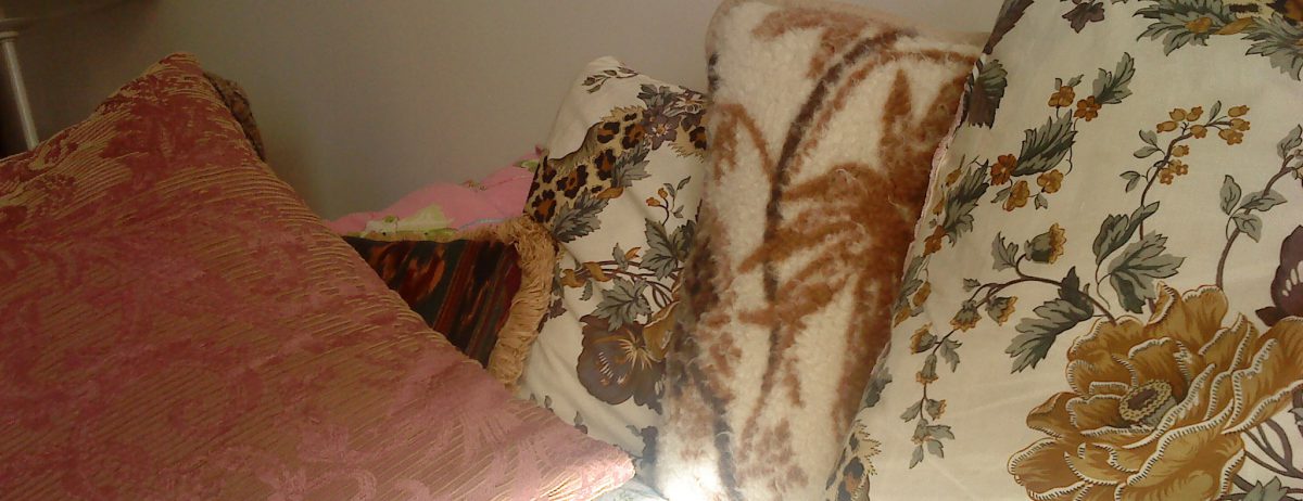
The colour range, which probably would be casually described as ‘bright’, is actually more towards muted than bright. In a design or craft context it would be referred to as ‘sub-brights’. Matthew Collings, ‘No Narrative’
My idea of a muted colour is of a colour that has had its intensity covered over by a grey veil. Or to use a more modern image, by a filter to give it, say, a sepia tint. Referring to muted colours as ‘sub-brights’ seems to completely reverse this idea: rather than being a covering, muteness stretches itself out like a subterranean stratum beneath the casual luminosity of colours. Where it breaks through, the colour becomes sub-bright.
Reading bright colours as a metaphor for lingusitic expression may be one way of understanding the muteness that is the ground of all language. As we chatter along, we let the said cover over the unsaid, which nonetheless remains there beneath our words. Sometimes it breaks through; a rugged rock tearing into the casual luminosity of speech.
